# 你可能不知道的 Animation 动画技巧与细节
# 引言
在 web 应用中,前端开发在实现动画效果时往往常用的几种方案:
- CSS3 transition / animation —— 实现过渡动画
- setInterval / setTimmeout —— 通过设置一个间隔时间来不断的改变图像的位置
- requestAnimationFrame —— 通过一个回调函数来改变图像位置,有系统来决定这个回调函数的执行时机,必定是修改的性能更好,不存在失帧现象。
在大多数需求中,css3 的 transition / animation 都能满足我们的需求,并且相对于 js 实现,可以大大提升我们的开发效率,降低开发成本。
本篇文章将着重对 animation 的使用做个总结,如果你的工作中动画需求较多,相信本篇文章能够让你有所收获:
- Animation 常用动画属性
- Animation 实现不间断播报
- Animation 实现回弹效果
- Animation 实现直播点赞效果
- Animation 与 Svg 又会擦出怎样的火花呢?
- Loading 组件
- 进度条组件
- Animation steps() 运用
- 实现打字效果
- 绘制帧动画
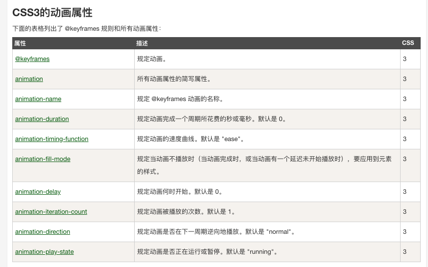
# Animation 常用动画属性
介绍完 animation 常用属性,为了将这些属性更好地理解与运用,下面将手把手实现一些 DEMO 具体讲述。
# Animation 实现不间断播报
通过修改内容在父元素的 y 轴位置来实现广播效果
<!DOCTYPE html>
<html lang="en">
  <head>
    <meta charset="UTF-8" />
    <title>不间断播报</title>
    <style>
      @keyframes scroll {
        0% {
          transform: translate(0, 0);
        }
        100% {
          transform: translate(0, -160px);
        }
      }
      .container {
        width: 220px;
        height: 40px;
        background: #0066ff;
        overflow: hidden;
        border-radius: 2em;
      }
      .ul {
        animation-name: scroll;
        animation-duration: 5s;
        animation-timing-function: linear;
        animation-iteration-count: infinite;
      }
      .li {
        line-height: 40px;
        vertical-align: bottom;
        color: #fff;
        text-align: center;
      }
    </style>
  </head>
  <body>
    <div class="container">
      <div class="ul">
        <div class="li">小刘同学加入了凹凸实验室</div>
        <div class="li">小邓同学加入了凹凸实验室</div>
        <div class="li">小李同学加入了凹凸实验室</div>
        <div class="li">小王同学加入了凹凸实验室</div>
        <!--   插入用于填充的数据数据 -->
        <div class="li">小刘同学加入了凹凸实验室</div>
      </div>
    </div>
  </body>
</html>
此处为了保存广播效果连贯性,防止滚动到最后一帧时没有内容, 需要多添加一条重复数据进行填充。
# Animation 实现回弹效果
通过将过渡动画吃啊分为多个阶段,每个阶段的 top 属性停留在不同位置来实现。
<!DOCTYPE html>
<html lang="en">
  <head>
    <meta charset="UTF-8" />
    <title>回弹效果</title>
    <style>
      @keyframes animate {
        0% {
          top: -100%;
          opacity: 0;
        }
        25% {
          top: 60%;
          opacity: 1;
        }
        50% {
          top: 48%;
          opacity: 1;
        }
        75% {
          top: 52%;
          opacity: 1;
        }
        100% {
          top: 50%;
          opacity: 1;
        }
      }
      button {
        padding: 6px 20px;
        font-size: 14px;
        position: absolute;
        left: 50%;
        top: 50%;
        transform: translate(-50%, -50%);
        background: #0066ff;
        color: white;
        border: 0;
        border-radius: 2em;
        outline: none;
      }
      button:hover {
        opacity: 0.8;
        cursor: pointer;
      }

      .popup {
        position: fixed;
        top: -50%;
        width: 300px;
        line-height: 200px;
        text-align: center;
        background: #0066ff;
        color: #fff;
        border-radius: 0.25em;
        box-shadow: 0 0 10px #ccc;
        left: 50%;
        transform: translate(-50%, -50%);
      }

      .popup.active {
        animation-name: animate;
        animation-duration: 0.5s;
        animation-timing-function: cubic-bezier(0.21, 0.85, 1, 1);
        animation-iteration-count: 1;
        animation-fill-mode: forwards;
      }

      .close {
        width: 40px;
        line-height: 40px;
        height: 40px;
        border-radius: 50%;
        background: #fff;
        color: #000;
        font-size: 20px;
        top: 100%;
        box-shadow: 0 0 10px #888484;
        cursor: pointer;
        position: absolute;
        left: 50%;
        transform: translate(-50%, -50%);
      }

      .close:hover {
        filter: brightness(0.9);
      }
    </style>
  </head>
  <body>
    <button>唤起弹窗</button>
    <div class="popup">
      我是弹窗
      <div class="close">x</div>
    </div>
  </body>
  <script>
    const show = document.getElementsByTagName("button")[0];
    const close = document.getElementsByClassName("close")[0];
    const popup = document.getElementsByClassName("popup")[0];

    show.onclick = function () {
      popup.className += " active";
    };

    close.onclick = function () {
      popup.className = "popup";
    };
  </script>
</html>
为了让过渡效果更自然,这里通过 cubic-bezier() 函数定义一个被塞尔曲线来控制动画播放速度。
过渡动画执行完成后,为了让元素应用动画最后一帧的属性值,我们需要使用 animation-fill-mode: forwards 。
# Animation 实现点赞效果
为了让气泡可以向上偏移,我们需要先实现一个 y 轴方向向上移动的动画。
为了让气泡向上偏移时显得不那么单调,我们再实现一个 x 轴方向上移动的动画。
这里是我的理解:
虽然是通过修改 margin 来改变 x 轴偏移距离,但实际上与修改 transform 没有太大的性能;
因为通过 @keyframes animation-y 中的 transform 已经新建了一个渲染层;
animation 属性可以让该渲染层提升至合成层拥有单独的图形层,即开启了硬件加速,不会影响其他渲染层的 paint、layout;
对于合成层不是很了解的同学,可以阅读一下这篇文章从浏览器渲染层面解析 css3 动效优化原理 (opens new window)
如下图所示
<!DOCTYPE html>
<html lang="en">
  <head>
    <meta charset="UTF-8" />
    <title>直播点赞动画</title>
    <style>
      @keyframes animation-y {
        0% {
          transform: translate(-50%, 100px) scale(0);
        }
        50% {
          transform: translate(-50%, -100px) scale(1.5);
        }
        100% {
          transform: translate(-50%, -300px) scale(1.5);
        }
      }

      @keyframes animation-x {
        0% {
          margin-left: 0px;
        }
        25% {
          margin-left: 25px;
        }
        75% {
          margin-left: -25px;
        }
        100% {
          margin-left: 0px;
        }
      }

      .btn {
        top: 80%;
        user-select: none;
        width: 50px;
        line-height: 50px;
        background: #0066ff;
        color: #fff;
        text-align: center;
        border-radius: 50%;
        box-shadow: 0 0 10px #999;
        cursor: pointer;
        position: absolute;
        left: 50%;
        transform: translate(-50%, -50%);
      }
      .btn:hover {
        opacity: 0.8;
      }
      .btn:active {
        opacity: 1;
      }

      .like {
        position: absolute;
        left: 50%;
        top: 50%;
        transform: translate(-50%, -50%);
        width: 25px;
        height: 23px;
        pointer-events: none;
        background-size: cover;
        background-position: center;
        background-repeat: no-repeat;
        background-image: url(https://upload.wikimedia.org/wikipedia/commons/thumb/4/44/Coraz%C3%B3n.svg/150px-Coraz%C3%B3n.svg.png);
        animation: animation-x 3s 0s linear infinite, animation-y 4s 0s linear 1;
      }
      .like.second {
        background-image: url(https://upload.wikimedia.org/wikipedia/commons/thumb/4/44/Coraz%C3%B3n.svg/150px-Coraz%C3%B3n.svg.png);
        animation: animation-x 3s -2s linear infinite,
          animation-y 4s 0s linear 1;
      }
    </style>
  </head>
  <body>
    <div class="btn" onclick="like()">点赞</div>
  </body>
  <script>
    var count = 0;
    function like() {
      var dom = document.createElement("div");
      count += 1;
      dom.className = count % 2 ? "like second" : "like";
      dom.style.willChange = "margin-top";
      document.body.appendChild(dom);
      setTimeout(function () {
        document.body.removeChild(dom);
      }, 2000);
    }
  </script>
</html>
# Animation 与 Svg 绘制 loading / 进度条 组件
<!DOCTYPE html>
<html lang="en">
  <head>
    <meta charset="UTF-8" />
    <title>Loading / 进度条</title>
    <style>
      :root {
        --color: #0079f5;
      }
      div {
        color: var(--color);
        position: absolute;
        left: 50%;
        top: 50%;
        transform: translate(-50%, -50%);
      }

      div label {
        display: flex;
        align-items: center;
      }

      @keyframes loading-active {
        0% {
          stroke-dashoffset: 0;
        }
        100% {
          stroke-dashoffset: -207;
        }
      }

      .loading svg {
        transform: rotate(-150deg);
      }

      .loading circle {
        animation: loading-active 1s 0s ease-out infinite;
      }

      .progress circle {
        stroke-dasharray: 157 157;
        stroke-dashoffset: 0;
        stroke-linecap: round;
        transition: stroke-dashoffset 0.8s cubic-bezier(0.29, 0.6, 0.42, 0.99);
      }

      .progress .trail {
        stroke-dashoffset: 0;
      }

      .progress span {
        left: 118px;
        top: 150px;
        position: absolute;
        transform: translate(-50%, -50%);
      }
      .progress button {
        margin-right: 5px;
        border: 0;
        color: #fff;
        padding: 4px 10px;
        background: var(--color);
        border-radius: 0.25em;
        outline: none;
      }
      .progress button:hover {
        opacity: 0.8;
      }
    </style>
  </head>
  <body>
    <div>
      <label class="loading">
        Loading:
        <svg with="100" height="100" viewBox="0 0 60 60">
          <circle
            cx="30"
            cy="30"
            r="25"
            fill="transparent"
            stroke-width="4"
            stroke="#0079f5"
            stroke-dasharray="50 157"
            stroke-linecap="round"
          ></circle>
        </svg>
      </label>
      <label class="progress">
        进度条:
        <svg with="100" height="100" viewBox="0 0 60 60">
          <defs>
            <linearGradient id="gradient" x1="100%" y1="0%" x2="0%" y2="0%">
              <stop offset="0%" stop-color="#0079f5"></stop>
              <stop offset="100%" stop-color="#6149f6"></stop>
            </linearGradient>
          </defs>
          <circle
            class="trail"
            cx="30"
            cy="30"
            r="25"
            fill="transparent"
            stroke-width="4"
            stroke="#eee"
          ></circle>
          <circle
            id="progress-bar"
            class="path"
            cx="30"
            cy="30"
            r="25"
            fill="transparent"
            stroke-width="4"
            stroke="url(#gradient)"
            style="stroke-dashoffset: 141.3"
          ></circle>
        </svg>
        <span id="progress-detail">20%</span>
        <button onclick="reduce()">减少</button>
        <button onclick="add()">增加</button>
      </label>
    </div>
  </body>

  <script>
    const bar = document.getElementById("progress-bar");
    const detail = document.getElementById("progress-detail");
    const total = 157; // 圆周长
    const per = total / 100; //一个百分比进度代表的周长
    let progress = 20; // 当前百分比进度

    function add() {
      if (progress >= 100) {
        return;
      }
      progress += 20;
      update();
    }

    function reduce() {
      if (progress <= 0) {
        return;
      }
      progress -= 20;
      update();
    }

    function update() {
      bar.style.strokeDashoffset = total - per * progress;
      detail.innerHTML = `${progress}%`;
    }
  </script>
</html>